



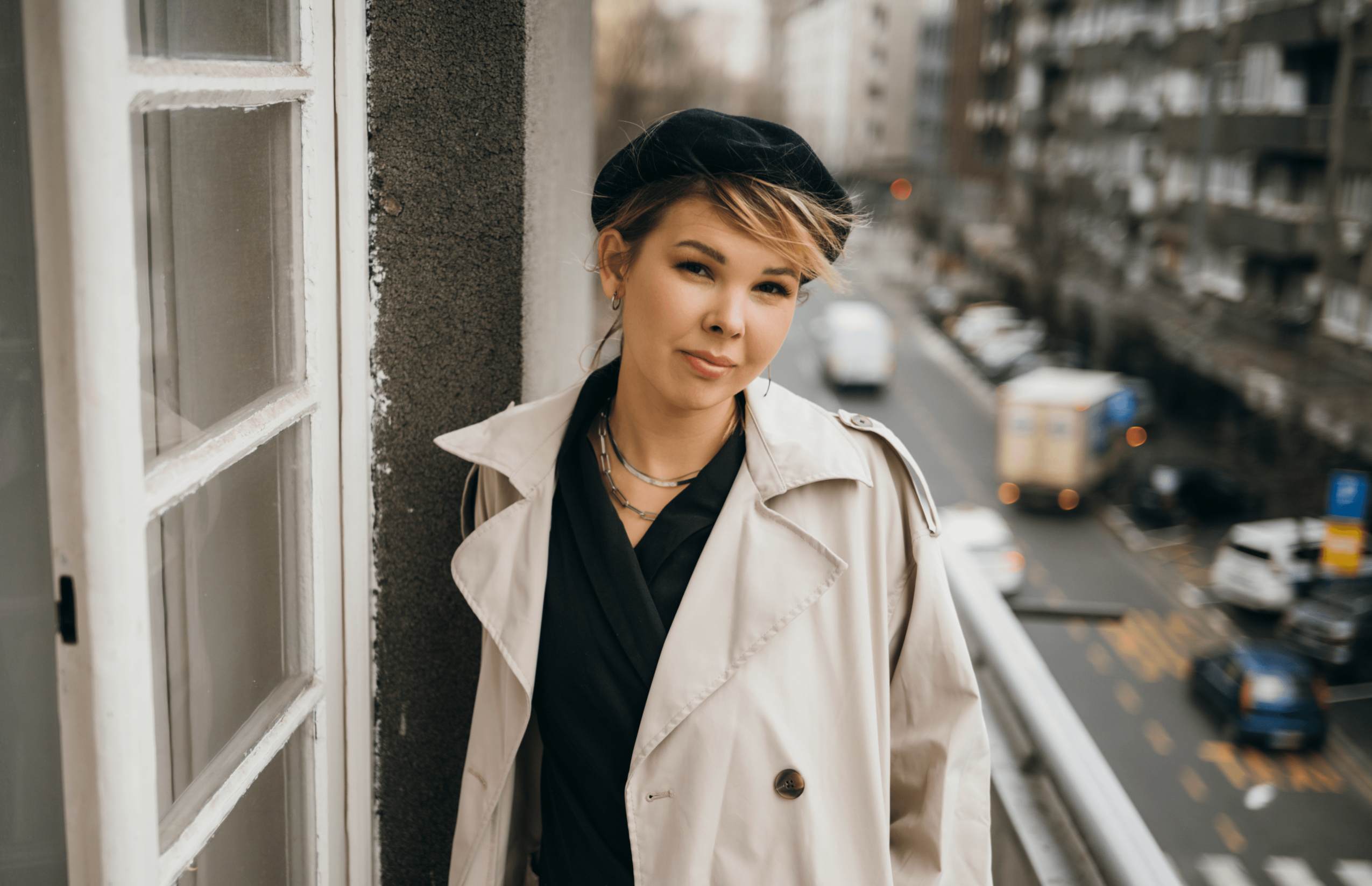
Today we’d like to introduce you to Sasha Denisova.
Hi Sasha, thanks for joining us today. We’d love for you to start by introducing yourself.
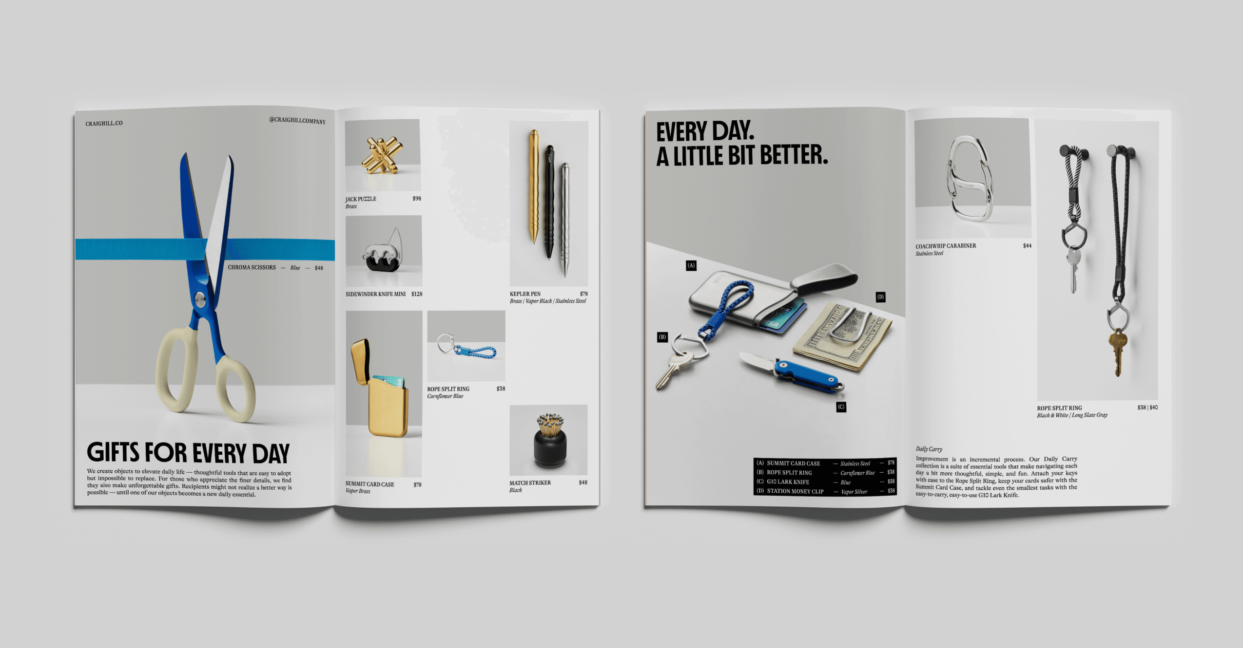
I’m Sasha Denisova, a New York–based brand and type designer, currently working as a Senior Brand Designer at Red Antler while also running my independent type design practice.
Interestingly, I never originally planned to become a graphic designer. I actually earned my master’s degree in stage design and thought that was the direction my career would take. But somewhere along the way, I landed an internship at a design agency, and I still vividly remember my very first day. I was walking home feeling ridiculously happy, with this overwhelming realization that I’d found something I genuinely loved doing. It was one of those rare moments when you just know you’re in the right place.
That was about ten years ago, and I’ve been working in design ever since. Looking back, my career has always been driven by a series of creative obsessions. First, it was illustration. Then I became fascinated with motion design and the possibilities of bringing graphic elements to life. And eventually, typography took over.
What started as an interest in letterforms gradually developed into a whole independent practice. I began designing original typefaces, experimenting with their personalities, structures, and expressive possibilities. Today, that obsession has grown into releasing commercial typefaces through international type foundries, alongside my work in branding.
Throughout my career, I’ve been lucky to work with some amazing creative teams, including four years at Clay Global (San Francisco-based agency), where I led branding and digital design projects for globally recognized companies. In 2025, I moved to New York, and today I’m a Senior Brand Designer at Red Antler, where I get to create identities for some truly top-notch brands.
My work has received international recognition from the Webby Awards, Awwwards, the Sreda Festival, and Typomania. My independent type projects include Biform, Kristolit, Nice Try, and Greenpoint Sans, with several receiving awards and recognition from international design organizations. I’ve also been fortunate to see my work featured in publications such as The Brand Identity, Creative Boom, Mindsparkle, Abduzeedo, and Typeroom.
What’s especially exciting to me is that these different interests have never really replaced one another. Illustration taught me to think about character and expression, motion design introduced a sense of rhythm and time, and typography brought an entirely new appreciation for structure and detail. All of them still influence how I approach brand design today.
I never really had a master plan to end up where I am. I’ve mostly followed whatever fascinated me enough to spend countless hours figuring it out. And somehow, those obsessions have turned into a career that allows me to work across disciplines, collaborate with talented people around the world, and keep making things I’m genuinely excited about.
We all face challenges, but looking back would you describe it as a relatively smooth road?
I think one of the biggest challenges I’ve faced was moving to a new country. Even when you’ve spent years building a career, relocating means leaving behind a lot of the professional and social capital you’ve accumulated. You might have a strong portfolio, experience, and recognition, but suddenly you’re in a place where you barely know anyone, and you have to build your network and sense of belonging almost from scratch.
When I moved to New York in 2025, I realized how much of a creative career is built on relationships, shared experiences, and being part of a community. It’s not something you can simply pack in a suitcase and bring with you.
So I’ve been making a conscious effort to put myself out there, meet other creatives, attend events, and become part of the local design and typography communities. One particularly meaningful moment was giving a lecture at Type Tonight in New York, where I got to share my type design work and creative process with fellow designers. It was my first public design talk in the US, and it felt like an important milestone in establishing myself here.
I’m still figuring things out, but I’ve come to appreciate that building a career isn’t just about the work you produce. It’s also about the people you meet, the conversations you have, and the communities you contribute to. Starting over can be intimidating, but there’s something exciting about getting to build that part of your life again, this time with a clearer idea of who you are and what you want to bring to the table.
Appreciate you sharing that. What else should we know about what you do?
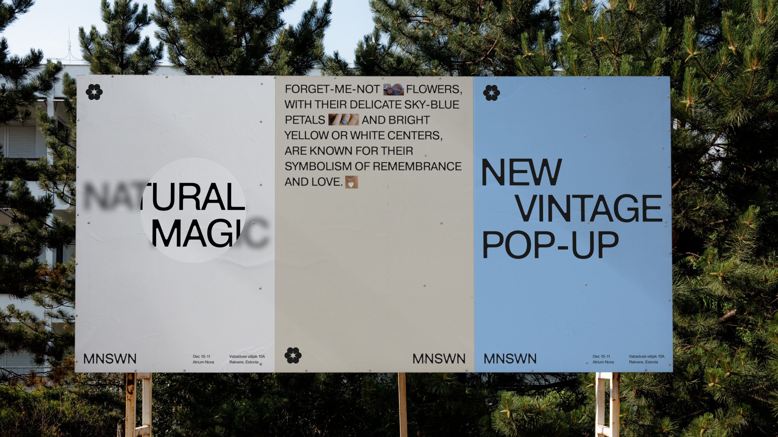
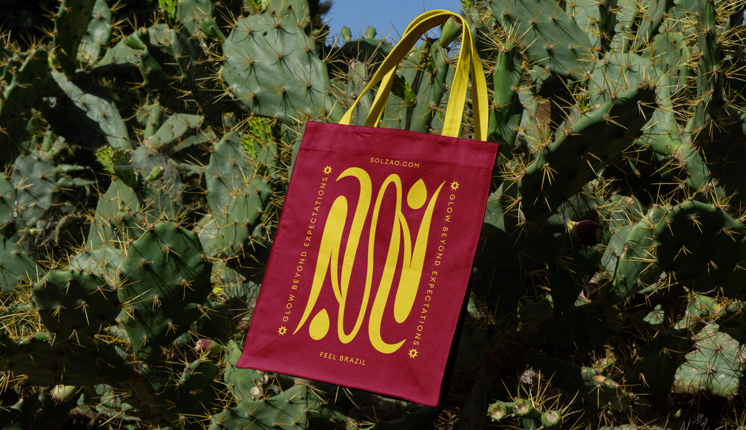
I work at the intersection of brand design and type design, and what I love most is how naturally the two come together. I create visual identities for brands, and sometimes that means designing an entirely custom typeface to give a brand its own distinctive voice.
I’ve always believed typography is one of the most powerful tools we have as designers. You can strip a layout of almost everything, but chances are there will still be some text. And if that text already speaks in the brand’s own voice, you’ve communicated something before adding a single image, color, or graphic element. That’s the kind of power I find fascinating.
At the same time, I’ve always had a thing for self-initiated projects. I love making things simply because an idea won’t leave me alone, without a client brief or a particular commercial goal. And interestingly, some of the biggest milestones in my career have come from those personal experiments.
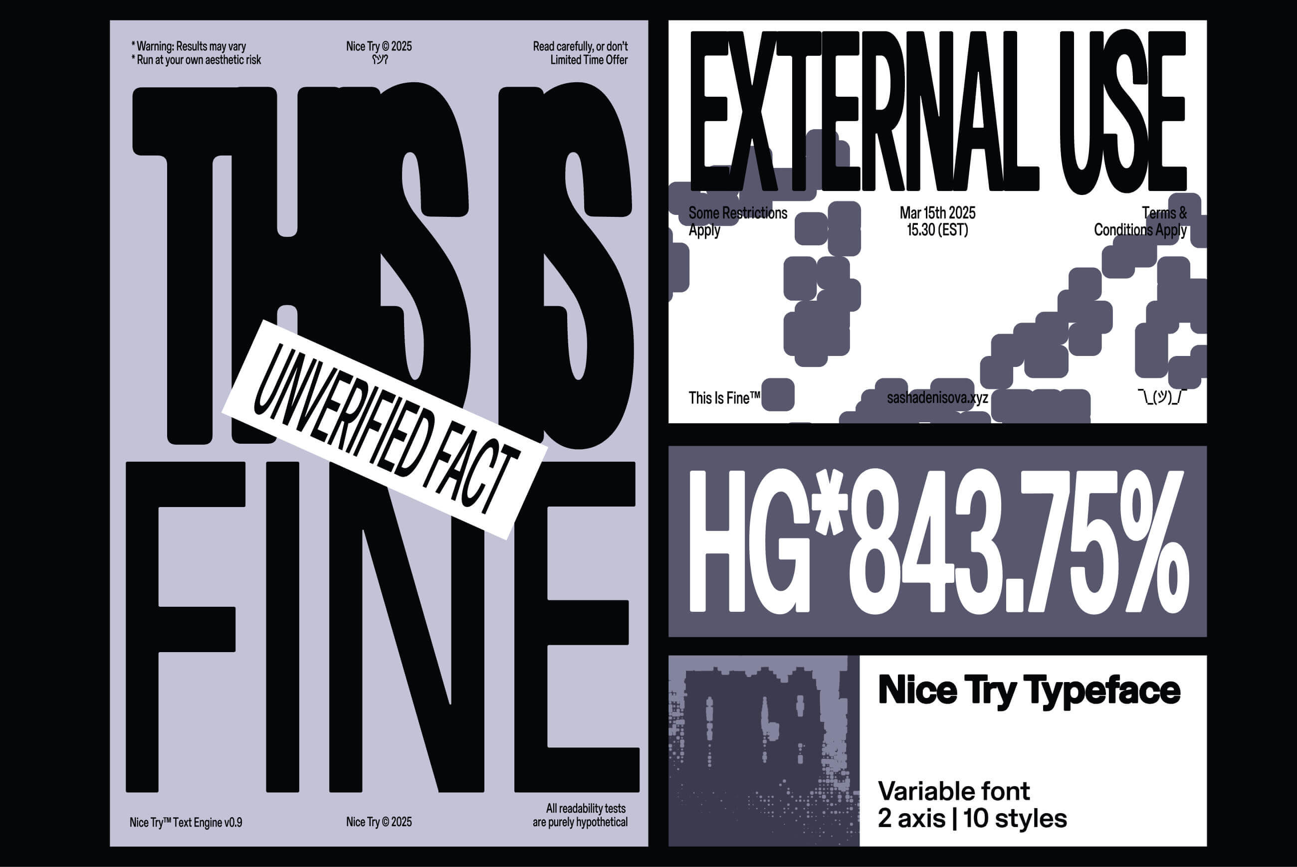
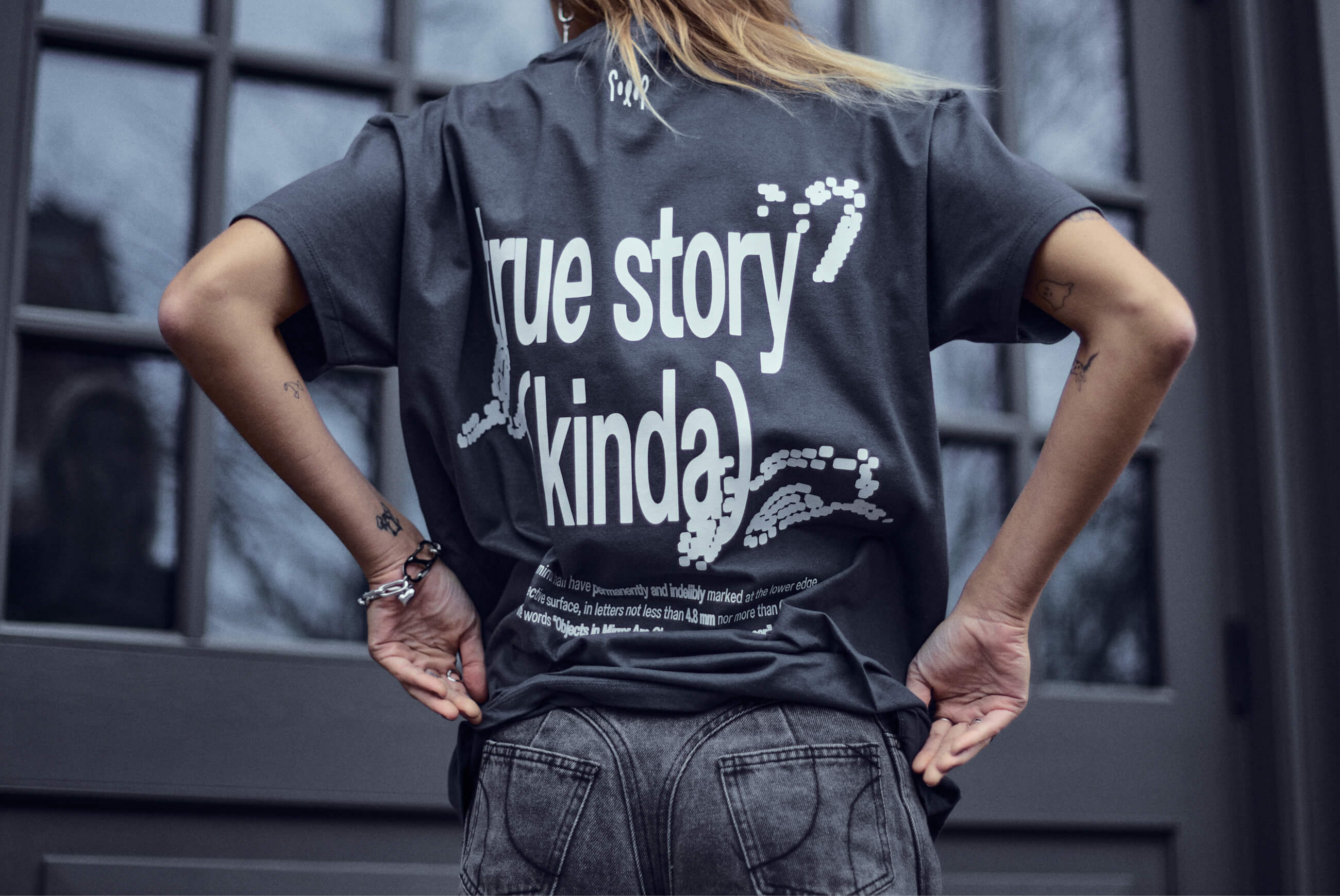
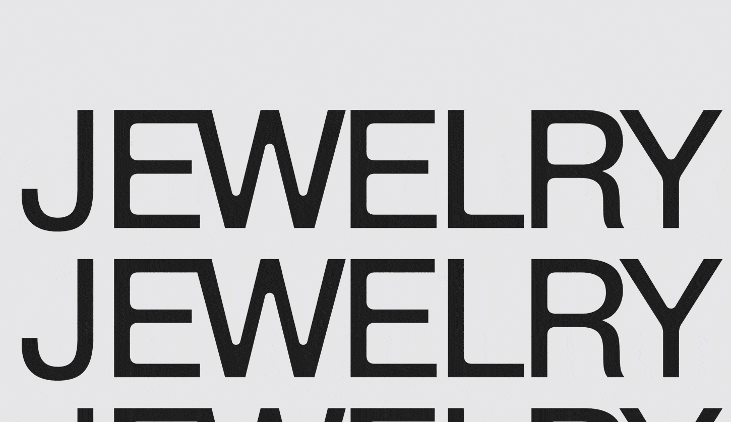
One project I’m particularly proud of is Nice Try, an experimental variable typeface that explores how dramatically letterforms can change through width and spacing. It started as a personal experiment and eventually grew into a complete type family with two variable axes. In 2025, it was shortlisted at the Sreda Festival in the Best Retail Typefaces category.
Risk taking is a topic that people have widely differing views on – we’d love to hear your thoughts.
Living in New York had been a childhood dream of mine, and at some point I realized I’d deeply regret it if I never gave it a shot. Leaving behind an established career and starting over in a new country was a big risk, but I knew I’d rather try than spend my life wondering what could have been. Getting my O-1 talent visa and finally making that dream happen was one of the most rewarding moments of my life.
Contact Info:
- Website: https://www.sashadenisova.xyz
- Instagram: https://www.instagram.com/sashadenisova.xyz/
- LinkedIn: https://www.linkedin.com/in/sashadenisovaxyz

Popular
-

Portraits of the Valley
-

LA’s Most Inspiring Stories
-

Greg Hex Is Turning the Everyday Kitchen Knife Into a Modern Design Object
-

Rick Norris Learned That Building a Successful Business Means Building a Life You Actually Want to Live
-

How Olivia Rush Turned Survival Into a Mission to Help Others Keep Going
-

How Bibi Goldstein Is Helping Entrepreneurs Reclaim Their Time by Embracing the Power of Delegation


