


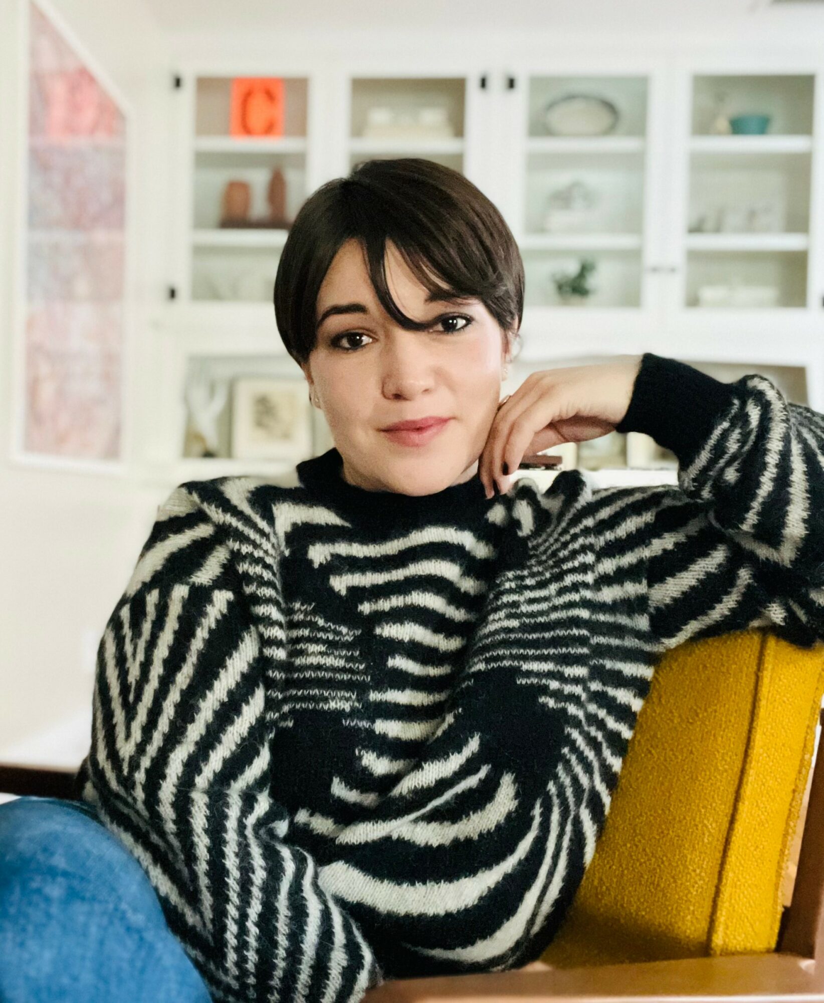
Today we’d like to introduce you to Emily Atwood.
Hi Emily, so excited to have you with us today. What can you tell us about your story?
From a young age, I had a curiosity for the beauty of language, communication, calligraphy, history, archaeology, anthropology, research, and storytelling. These seemingly disparate points of interest started to come together at the end of my education at Fordham University and solidified during my second degree, focused in design at Laguna College of Art + Design. I discovered that graphic design was a field that can adapt to any subject-matter where creative decisions are informed by research, and its final product serves a function. I now see my design process as an archaeological dig in many ways, uncovering the subject matter, discovering points of inspiration, and allowing these fragments to be reframed and visualized.
My career started as a User-Interface designer for a firm in Orange County. A couple months later an email from Paula Scher’s team at Pentagram in NY slipped into my inbox. I spent the next three years working on Paula’s team as a Senior Brand Identity Designer, where my interest in type design started to take shape. Almost every project I worked on called for custom type or commissioning a custom typeface. As a result, the specialized field of type design started to spark my interest, and suddenly my early fascination with language, form, communication, and history found common ground in designing typefaces. I obtained a certificate of Type Design through the Type@Cooper program at the Cooper Union in NYC, where I learned about historical type revivals and developing custom typefaces. The process of being able to revive or be inspired by historical letterforms and to create a functioning and typeable language struck a chord with my research-obsessed self.
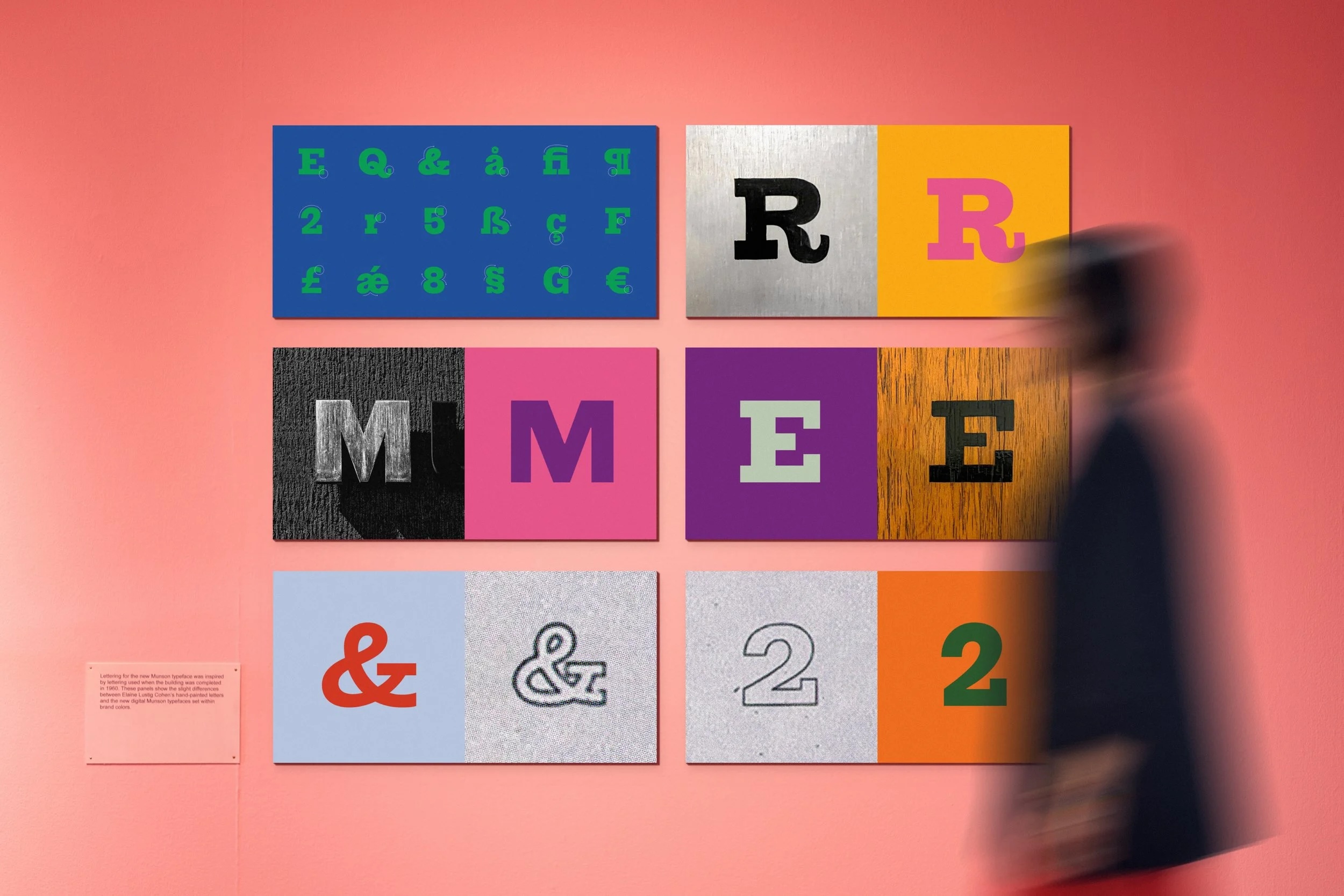
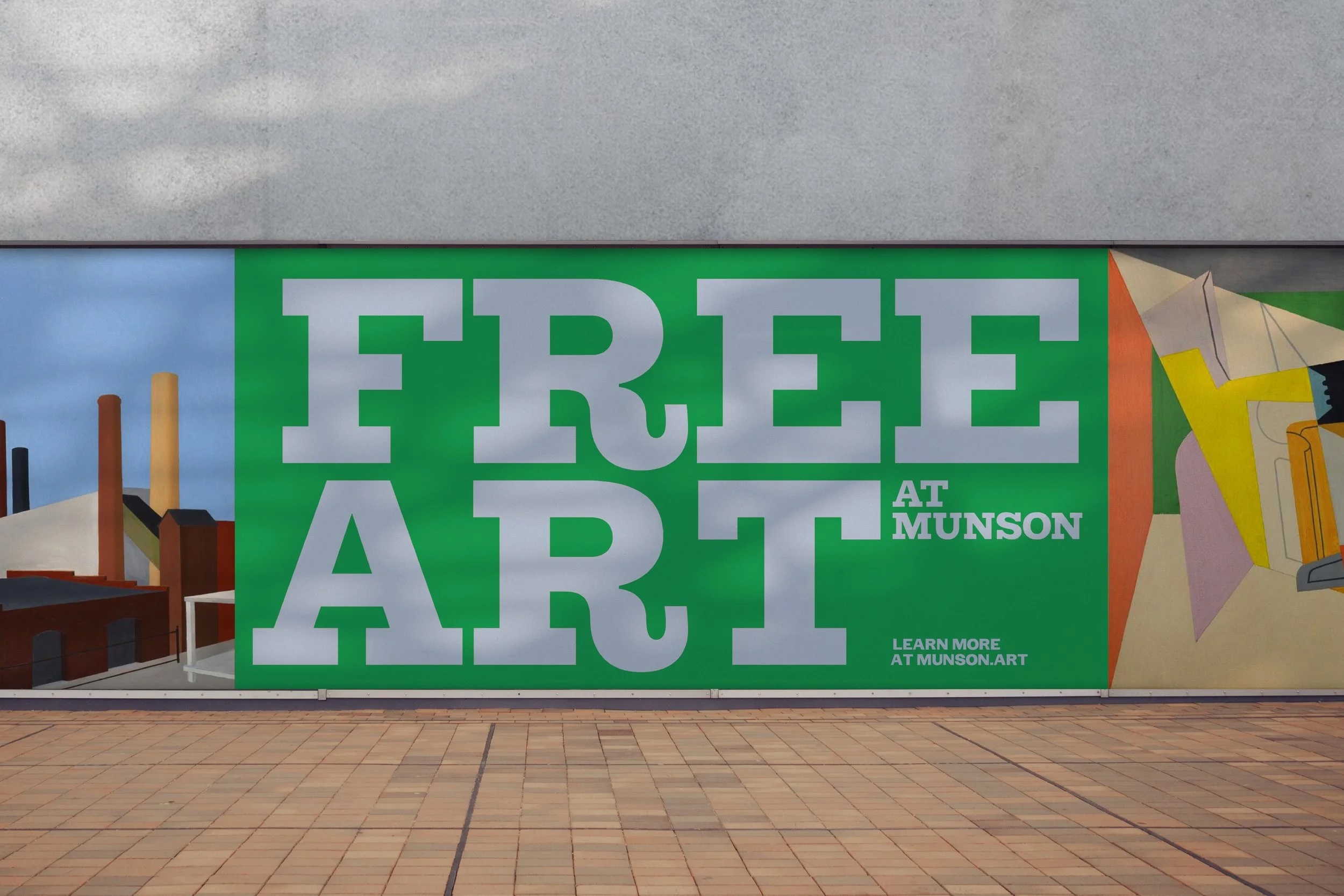
I pursued my interest in type and joined Order in Brooklyn, as a Senior Designer and Type Designer and with the ability to build brand identity systems including designing a custom typeface for it. While working there, I led the identity design and custom typeface for Munson, an art museum, performing arts center, and art school in upstate New York. In the research process for the project, I discovered that the interior signage of the museum was handpainted by renowned Graphic Designer, Elaine Lustig Cohen in the 1960s, a time when it was rare for women to be working in the field of design, designing type and signage, let alone owning their own studio. I ended up designing a multi-style typeface that paid homage to Elaine Cohen’s design and it is now used as the primary voice for Munson’s identity.
What felt like a rare occurrence, the opportunity to honor the work of a type designer who was a woman began to spark questions about other women in history— the role of women in the evolution of type either in actuality or speculatively. These questions have led to this new phase of work I am currently working toward which are story-driven typefaces that honor the typographic fragments women have left behind.
I am currently an Independent Designer who specializes in type design, which includes custom wordmarks, fonts and lettering as well as brand identity design. I am also an Adjunct Faculty member at Laguna College of Art + Design, teaching typography and senior thesis courses.
Can you talk to us a bit about the challenges and lessons you’ve learned along the way. Looking back would you say it’s been easy or smooth in retrospect?
I believe a creative career naturally consists of many movements or phases to one’s life; various pivots and evolutions—seasons where you are moved to create in one way or explore a particular topic until life spurs you into a new direction. Looking back, most of the obstacles in my career can be attributed to the larger conversation of how art and design is at odds with capitalism. There is an intense demand on our creativity to produce and churn out work at a high-level consistently often to meet fast deadlines, at least in my experience. I believe nurturing a designer’s creativity should be just as valuable as the work itself; there has to be balance. After a while, I realized that my own creative voice had become malnourished, and the personal cost of this nonstop creative output had been too great. I realized that I had to reexamine the framework I had been working in, pull myself out of it and find an approach to design more in line with how I need to produce. What initially felt like a speedbump ended up being a catalyst to think creatively about my life and my work. Now I control my design process, and it has created space for many other things in my life, which has fed back into my work.
Can you tell our readers more about what you do and what you think sets you apart from others?
I have produced many brand identity systems in the cultural and institutional space including the identity for the National Women’s History Museum, a campaign identity for the Public Theater in NYC, the editorial design for Paula Scher’s Art Monograph about her work for the Public Theater, and a typographic identity and typeface for a local nonprofit, People Partners. A couple years ago, I released my first typeface called Etude, a stencil typeface based on historical music notation with Order Type Foundry. Publishing Etude has been an amazing opportunity in and of itself, but it is extremely rewarding to see how people are using it, whether for editorial design, design conferences, album covers, or museum exhibition identities.
This new phase of work I am engaging with is an expansion on the idea of typefaces that honor the typographic fragments women have left behind. I currently have several typefaces in progress, all focused on a particular moment or woman in history that either was directly involved in type history or women whose “mark-making” could speculatively be turned into a typeface. The important part of this effort is not so much the typeface, but the power that our design work has to elevate certain stories. These letterforms can be vehicles for important points in history that need to be told or important questions that need to be asked. When put out into the world to be used by other designers, that meaning and history is spread further.
A lot of my time is devoted to mentoring and teaching the next generation of designers as Adjunct Faculty at Laguna College of Art + Design. I have spent the past year helping to redesign the Typography curriculum, integrating my type design education and practical experience designing type. In addition to teaching the year-long senior thesis course where students research, concept and visualize a design-driven solution addressing a pain point in the world.
What was your favorite childhood memory?
I grew up in a household that saw boredom as an opportunity for creativity. Each member of my family is in pursuit of an artistic skill whether it is ceramics, fine art, music, theater, singing or design. My mother is a ceramic artist and tapestry weaver, so my entire life I have been surrounded by making and art. Some of my favorite memories have been watching her making things out of clay in her studio, and in the background I can hear my father playing the piano while my brother practicing lines for a play in another room. I always tell my parents how grateful I am that they exposed us to the arts and cultivated an appreciation in us.
Contact Info:
- Website: https://www.ematwood.space
- Instagram: https://www.instagram.com/the_em_dash/
Popular
-

Christina Wren Steps Into the Director’s Chair to Tell Stories That Feel Like Home
-

Portraits of the Valley
-
LA’s Most Inspiring Stories
-

JordanL on ‘Breathe,’ Belief, and Building a Movement Beyond the Music
-

Megan Birney Rudert on How Access to Light Is Powering a More Sustainable and Equitable Future
-

Linda Kneidinger on Building Lasting Change Through Small Steps and Self-Compassion


