


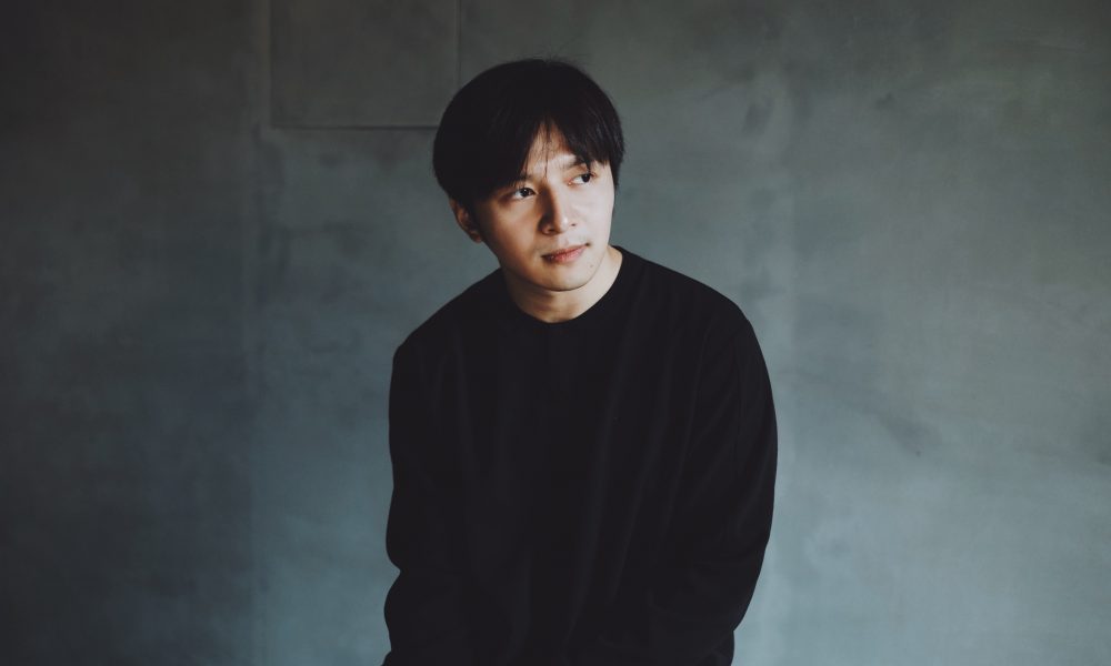
Today we’d like to introduce you to Ho Ting An.
Ho, we appreciate you taking the time to share your story with us today. Where does your story begin?
I’m a graphic designer, but I didn’t initially set out to become one. During my university, I noticed visual style differences among the various departments within the school. As a result, I self-recommended to the school administration to redesign the entire school’s identity, ranging from student IDs to department logos, from posters to the school emblem. This marked the beginning of a series of design projects. As I delved deeper into art direction, completing this project led me to be recognized across the entire school and be known as a “brand designer.”
Upon entering the workforce after graduation, I realized that very few people were combining Chinese typography with animation and advertising. So, I began seeking mentors and exploring this niche. Few years later, I transitioned from being someone searching for answers to being someone providing them.
Currently, my main focus is on shaping brand identities and undertaking the art direction of commercial designs. In my remaining time, I find myself engaging in arguments with my cat.
Would you say it’s been a smooth road, and if not, what are some of the biggest challenges you’ve faced along the way?
There are some things in life that we take for granted, details so small that we don’t notice until they’re pointed out. One such thing is the Chinese characters we see every day – and the different faces they put on.
Bubble tea shops, for example, have been sporting signs and menus in retro typefaces for the past few years. Fried chicken stands, on the other hand, stand out with a more modern and dignified font. Still other vendors have different signature scripts, some that simply seem cuter than others.
When you’re asked to design a logo, you’ve got to consider how to incorporate the brand’s Chinese name. One time, I was unable to find a font that suited my client’s needs and had to design one myself. It was during this process that I realized I was digging myself into a deep hole which could easily take a lifetime to fill.
Only by learning the history and evolution of typography could he come up with something fresh in design. From Chinese typefaces such as Ming, Gothic and Kai to English font types, I delved deep into the research myself as there weren’t any relevant courses in Taiwan.
Alright, so let’s switch gears a bit and talk business. What should we know about your work?
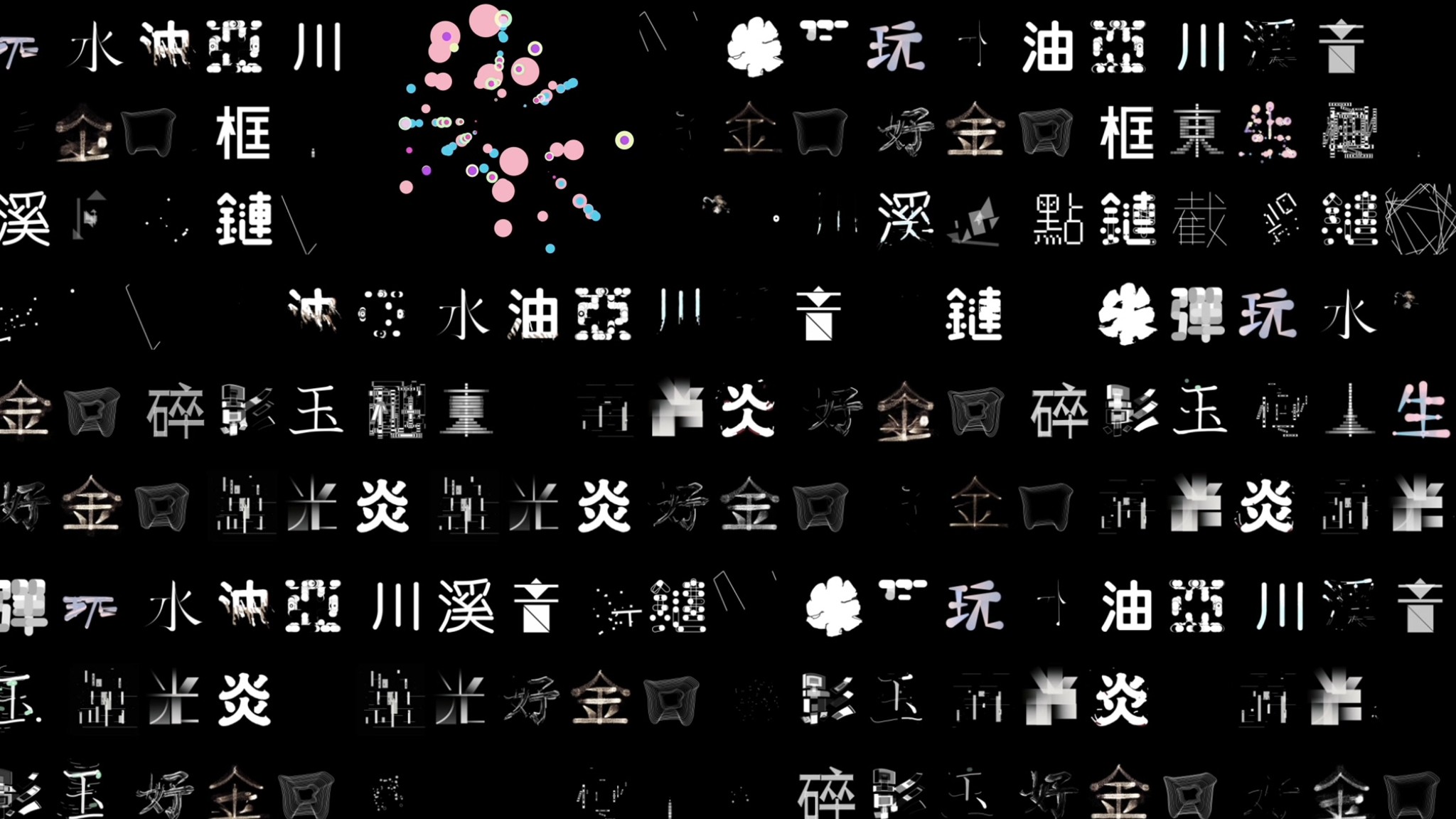
With the advent of digital media, motion graphic design’s role in the dissemination of information is becoming even more important. As a graphic designer, I wanted to create a database to show the clients my expertise in motion graphics.
With this idea in mind, I launched the Motion Type Project few years ago, which played with the different strokes and structures of Chinese characters. Going one step further, I subverted the forms, sounds, and meanings of the words I picked out to challenge the imagination of my clients.
Soon after project was launched, a large number of Chinese graphic and motion designers responded. It created a more experimental and boldly creative atmosphere around motion design and typography in the region. Although many people will imitate or plagiarize our work, I have long dreamed of seeing this scene come to life in the graphic design industry.
We all have a different way of looking at and defining success. How do you define success?
As long as one continues to live, enjoys their life, experiences a sense of accomplishment, and achieves self-realization, that, in my eyes, is success.
Contact Info:
- Website: http://tinganho.info
- Instagram: https://www.instagram.com/tinganho.info/
- Twitter: https://twitter.com/tinganho


Popular
-

What is the story you hope people tell about you when you’re gone?
-

Who were you before the world told you who you had to be?
-

Was there ever a time you almost gave up?
-

What is something outside of work that is bringing you joy lately?
-

Who saw you clearly before you could see yourself?
-

What are the biggest lies your industry tells itself?


